Capstone Study \\ 2021
GETTING sTUDENTS TO
THIER NEXT achievement
SUMMARY
With the lack of easily accessible housing resources for students it makes it extremely difficult for them to be able to open their availability to internships outside of their capable commute radius. Capstone operates as a bridge to connect students with short-term housing options near their internship.
THE PROBLEM
Students are missing out on internship opportunities because they are not within reach of those internships.
the scope
Design a high fidelity desktop prototype that will allow students to organize housing for internships outside their area.
MY ROLEs
UX RESEARCHER
• Conduct user surveys with the target audience in order to produce user personas to better understand the user base.
• Manage usability tests, on paper prototypes and low-fidelity prototypes to obtain user feedback.
UX DESIGNER
• Translate data from user research to develop empathy maps, journey maps, storyboards, and flowcharts to understand the user processes from start to finish within the application.
UI DESIGNER

• Produce sketched wireframes, digital wireframes, low fidelity application screens and iterate them based upon user feedback to create a high fidelity application.
solution
Design a website to act as a platform for students to easily search and apply for short-term housing. It should be very intuitive and simple to navigate for anyone.
Discovery and Research
This is the where I began the initial brainstorming for the application. This phase focused on gaining information on the target users and understanding them on deeper levels. Taking the pain points of users and creating opportunities to explore within the application.
Designing the app
Brainstorming
Developing initial idea of what the users need within the application

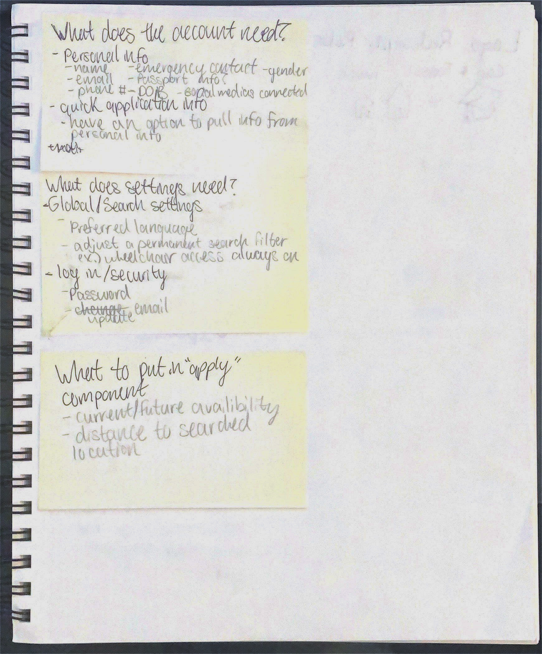
Brainstorming account, settings, and components features

Component Ideation

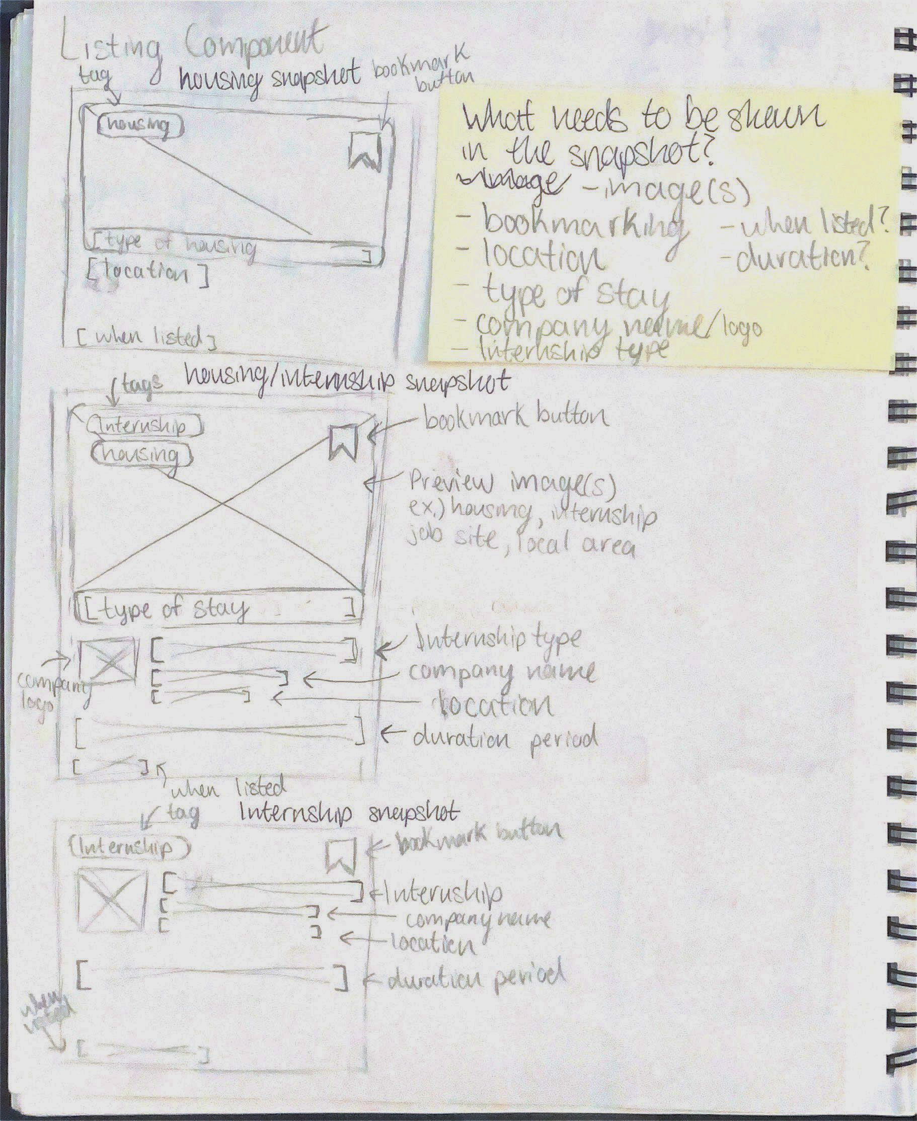
Listing Component Sketches

T a k e a w a y s
Set the foundation for what the application components could look like and ideas to possibly implicate
User Research
Tools Used
Google Surveys
Notion
Figma
Zoom
Specialist Interview
Amanda Stadel
Career Development Specialist at Jon M. Huntsman School of Business, Specializes in University Education Development​​​​​​​
Overview of the interview
• Problem discussion: Students not knowing about available resources 
• Problem discussion: Lack of a platforms to help connect students to more internships outside their area
• Topic: What problems are students facing other than finding an internship and founding housing that could effect their internship search?
• Topic: How do you feel about the importance of a platform to help with internship housing?• Topic: What short-term and long-term goals should a platform like this have?
T a k e a w a y s
Amanda commonly struggles to help students find internships within the local area due to the short supply of available positions
She believes there is a great need for resources regarding internships and helping students obtain them
She has seen students struggle to reach out to university faculty to organize internship opportunities and a platform to help organize housing could help students who choose to be more independent
Connectivity between different platforms for students to better coordinate their internship search
User Survey
Sample size: 32 total responses
Summary of results
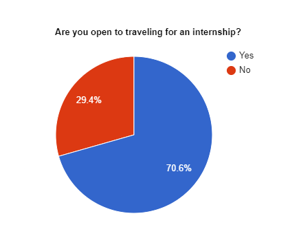
• Over 70% of participants states they were open to traveling for an internship and the second leading stressor to potentially traveling is planning their housing situation
• 30% of participants that are not open to traveling for an internship report that the housing situation is the leading cause of why, at 66.7%
• We also got data that supported that students would be open to many different types of housing, even if only a few were open to a certain option that was enough to show we should include it in our options
• Of the 2 participants that had to get housing for a past internship reported that they both did not know what the exact space they were staying in would look like
• 90% of participants were 21-23 years old and 53% of them were seniors in their undergraduate program
T a k e a w a y s
The leading stressor was expenses, and this platform could also help alleviate some of that problem, by removing application fees and giving an estimated cost of their stay including utilities and other miscellaneous costs.
The importance that a lack of a platform exists and there is a demand waiting to be fulfilled
Every housing option available there was at least 1 participant that would utilize that housing method. This also implies there might be more housing types not yet listed that students would also utilize.
Important insight to try and establish better communication of housing details for students so they know exactly what they are going to get before they get there. No surprises.
Competitive Analysis
Airbnb

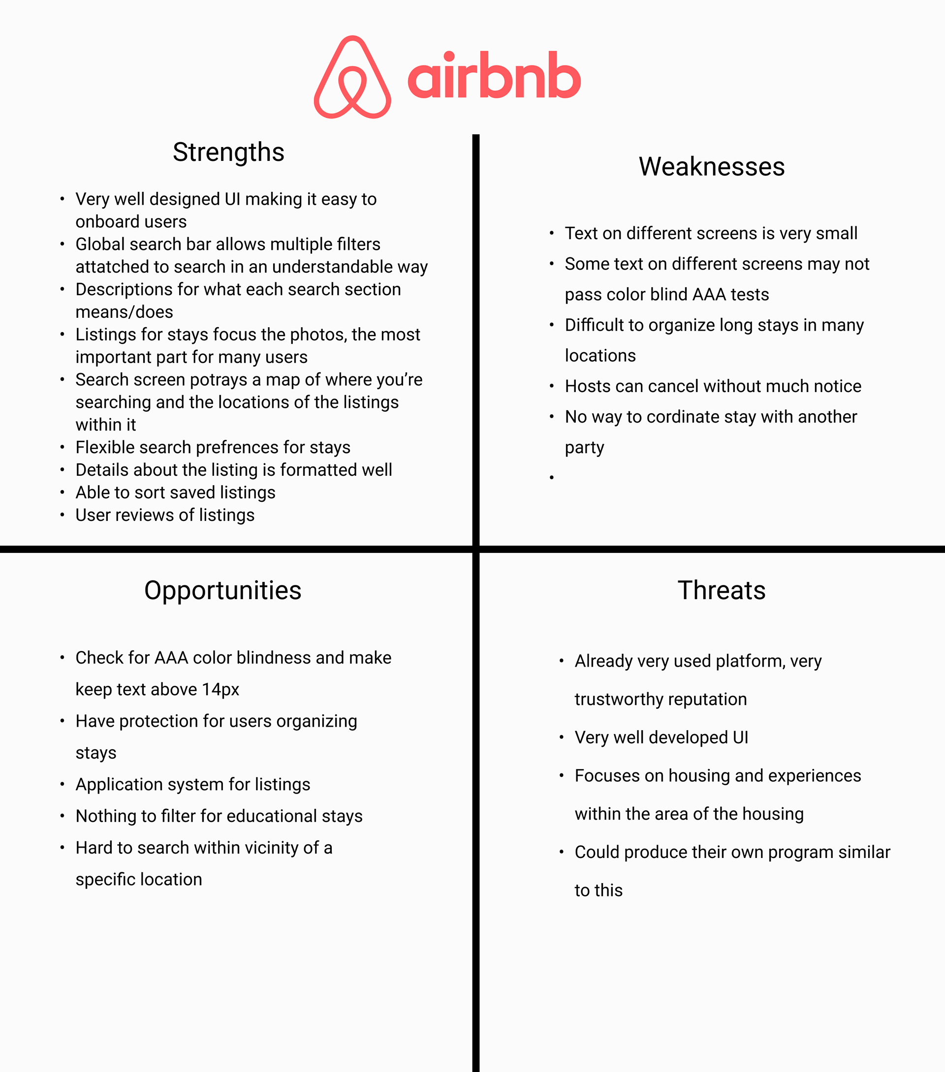
Airbnb competitive analysis

T a k e a w a y s
Airbnb does really well with their overall UI and they know how to push a user centric focus into their designs. They are very much able to push more user interactions on their platform causing users to spend more time on the app
I took inspiration from many aspects of their UI because the choices they made for their app uphold some of the best design practices
Ex.) The hamburger menu and profile icon are the same interaction for users. This is such a simple way to reduce clutter on navigation bars while still maintaining recognizability users will understand
Zillow

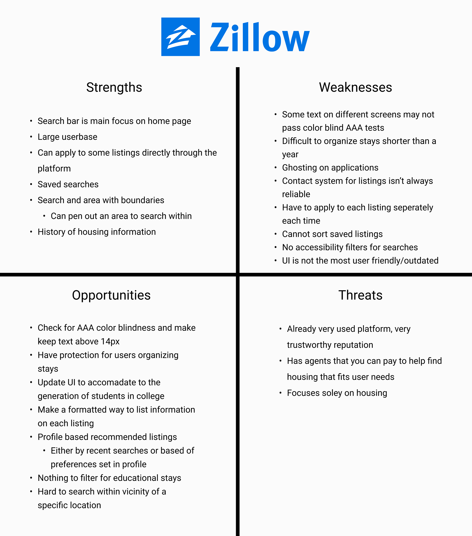
Zillow competitive analysis

T a k e a w a y s
Compared to Airbnb the search bar sits more into the center of the screen after loading into the home page. This helps bring more attention the the search bar being the literal center piece for the call to action
Simple home screen layout, there’s not much to scroll to other a few prompts. This helps not take away from the main goal and purpose of what Zillow was designed for
User Persona 1
Katie
Demographics:
Amber is a senior at the University of Michigan working part-time on the weekends to save money for her summer budget. She plans to apply for summer internships out-of-state to get a better idea of her career options.
Goals:
• Apply for summer internships out-of-state
• Find housing for an out-of-state internship
• Find roommates to live with
• Preplan a budget for the duration of her internship
Motivations:
• Travel and experience new things before starting a full-time job
• Give insight into different cities she may want to work at in the future
• Save money for student expenses
• Prepare herself financially

Frustrations:
• Lack of resources to find student housing
• Having to utilize platforms not optimized for short-term housing
• Struggling to find roommates while applying for internships in different cities
• Most platforms don’t give an exact total of cost
User Persona 2
Lance
Demographics:
Lance is a senior at Wayne State University finishing his last semester. He is always working towards his next project deadline and is trying to prepare for his summer internship at the same time.
Goals:
• Find housing within a few miles of his upcoming internship
• Stay up to date on application responses
• Stay organized
• Be efficient with his time
Motivations:
• Unable to make a reasonable daily commute to the internship
• Save on commute cost
• Reduce stress worrying about finding housing
• Easily gets overwhelmed
• Consistently busy with school work

Frustrations:
• Difficult to sort housing through proximity to a location on most platforms
• Lack of responses from housing applications
• Difficult to organize and save housing listings he is interested in
• Having to fill out each housing application individually
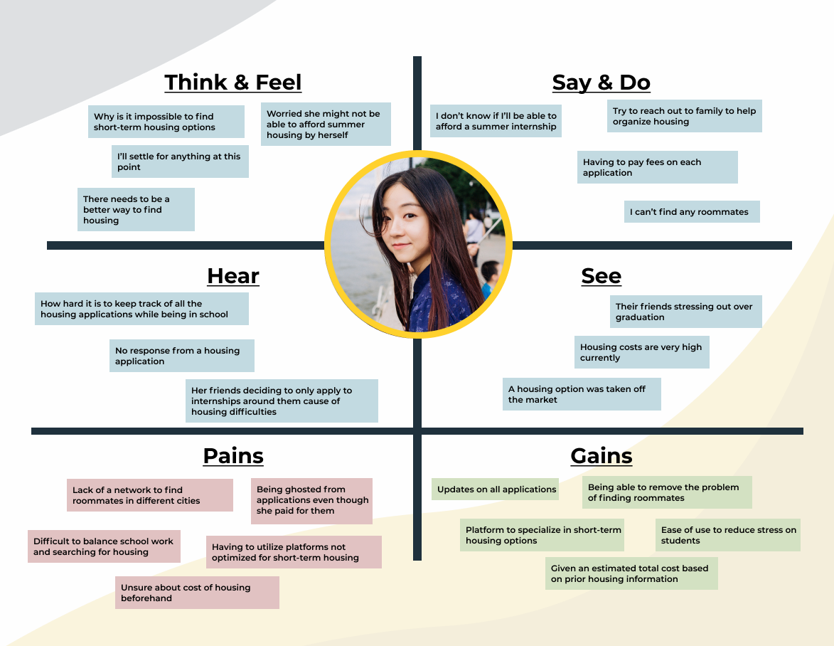
Empathy Map

Katie Empathy Map

T a k e a w a y s
Helped bring more insight into what an ideal user goes through without a platform like this and the pain points they go through
From those pain points I was able to have a more focus understanding of what the MVP should offer
• Ease of use; Quick search and application processes
• Pricing information already calculated for the user
User Stories
• As a student, I want to apply for housing quickly and easily, so I maximize my time and minimize stress. 
• As a user, I want to receive updates on my applications, so I can plan my accordingly.
• As a user, I want to know the total cost of my housing before I’m under contract, so I know exactly what to expect.
• As a user, I want to know how far the housing is from where my internship is, so I can calculate commute times and transportation methods.
T a k e a w a y s
The user stories helped maintain a guide for what the MVP needs to align with and should accomplish for the users that are going to utilize it
Information Architecture
After developing a deeper understanding of the target users, I moved into developing the ways the user will interact with the application. Understanding the goals of the users and applying that into the structure of the application. Then finally developing an initial prototype.
User Flows

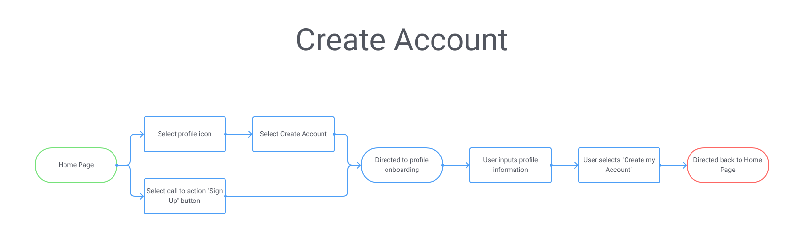
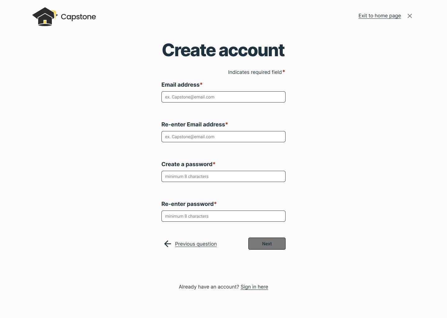
Account creation user flow

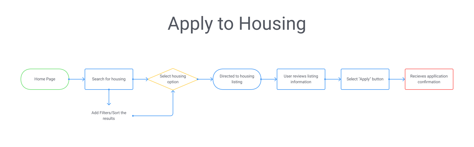
Housing applications user flow

T a k e a w a y s
Helped confine the scope of the application to better focus on the MVP while also giving direction to how the application screens/features are expected to function.
Wireframes sketches
Initial brainstorming of application screens on paper. This enabled a quick rudimentary idea to form for the navigation and relationship between screens.

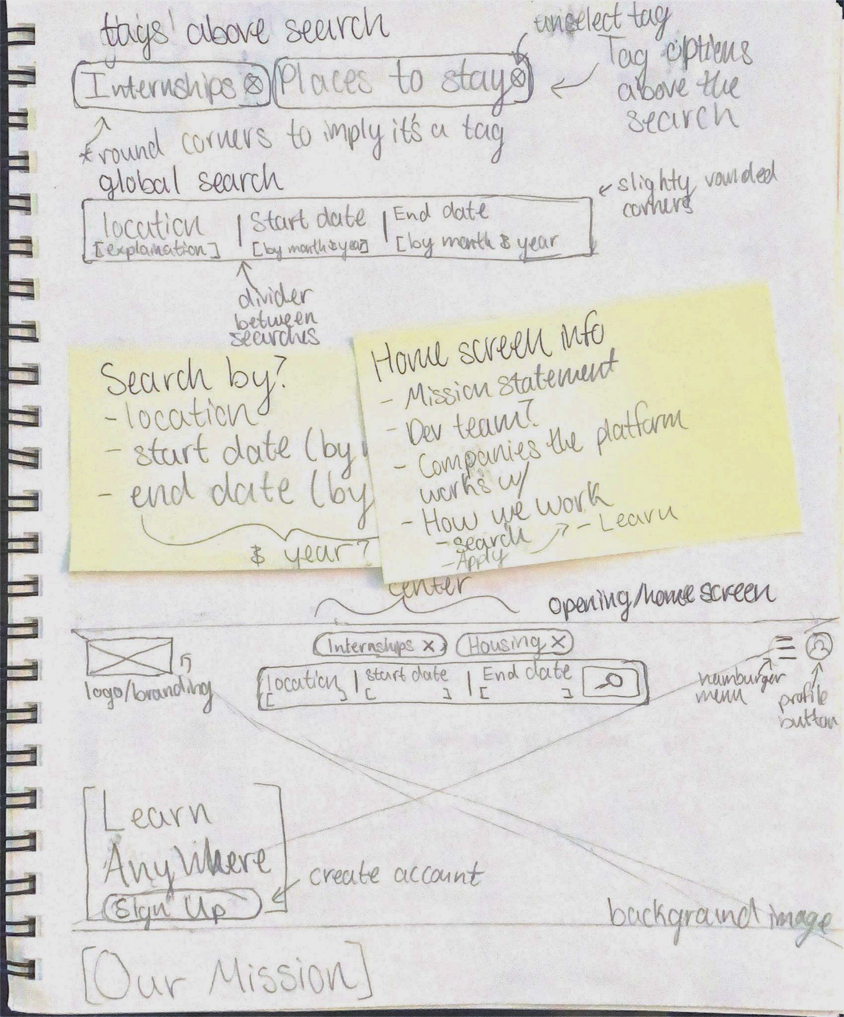
Home Screen Wireframe Sketches

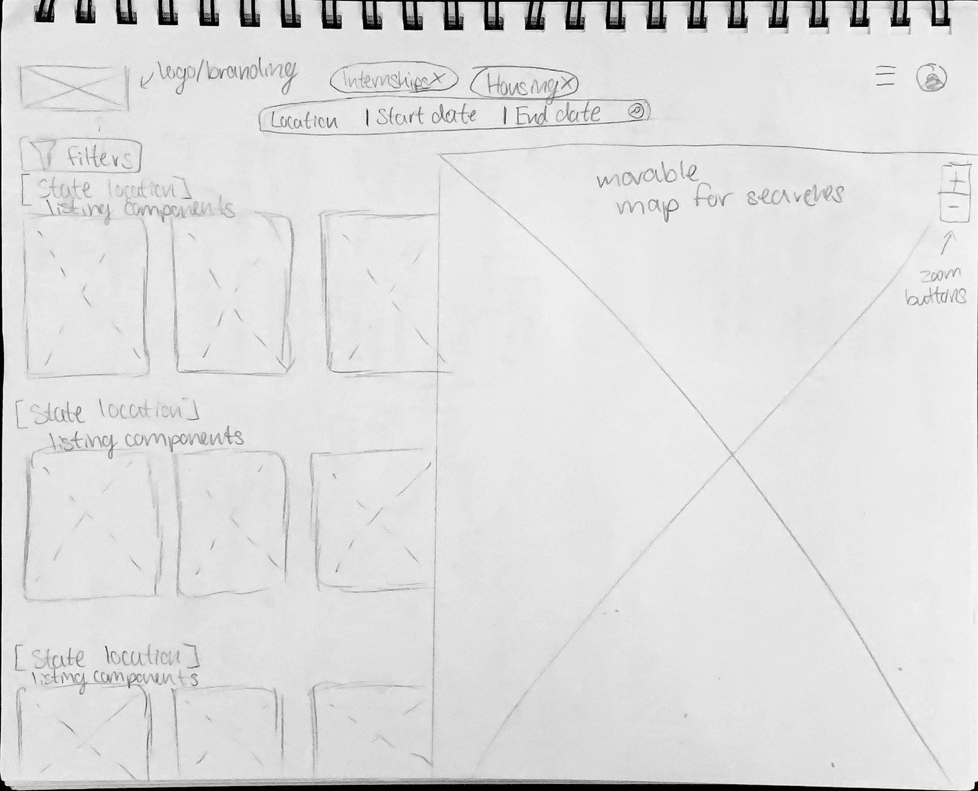
Listings Screen Wireframe Sketches

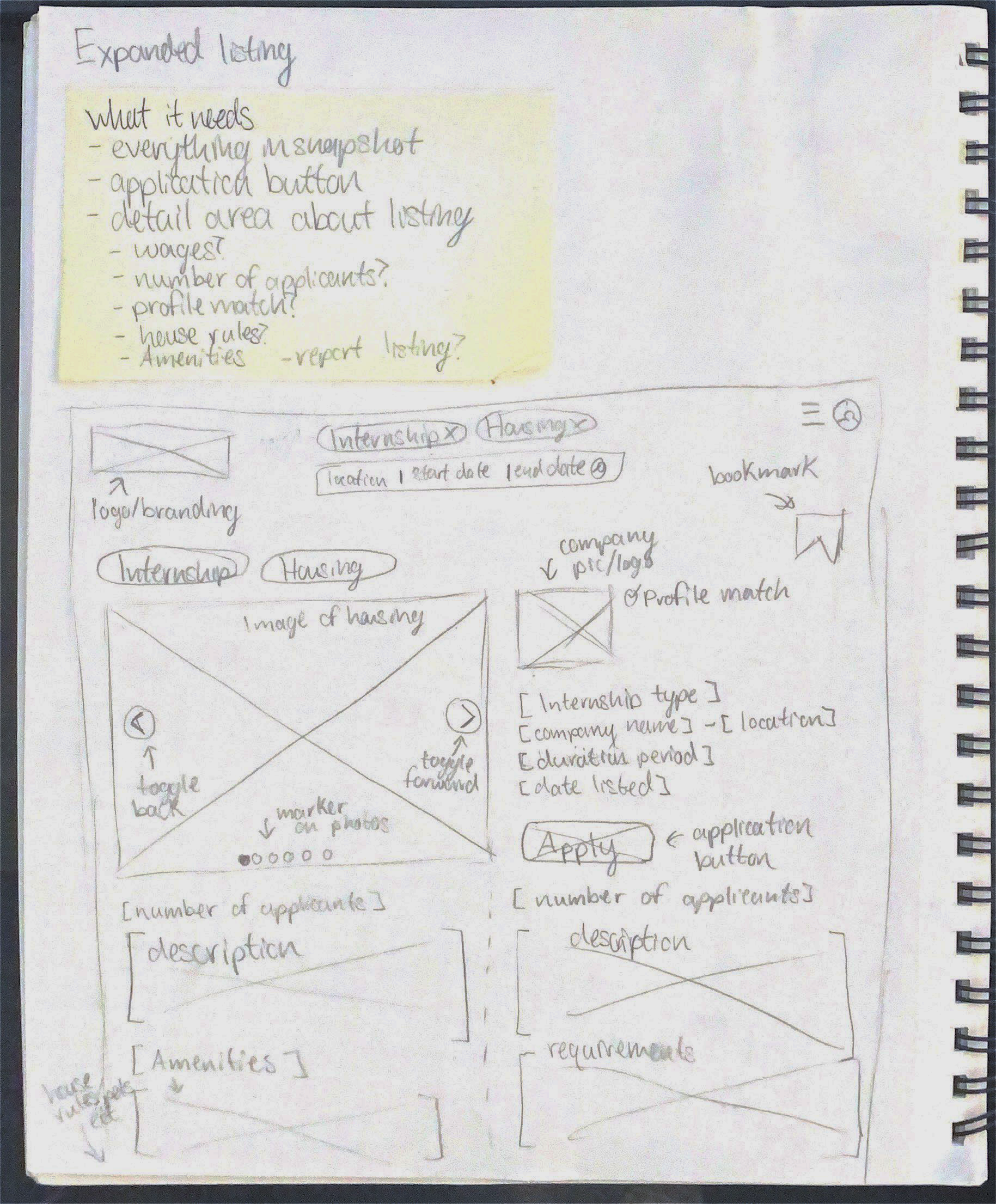
Expanded Listing Screen Wireframe Sketches

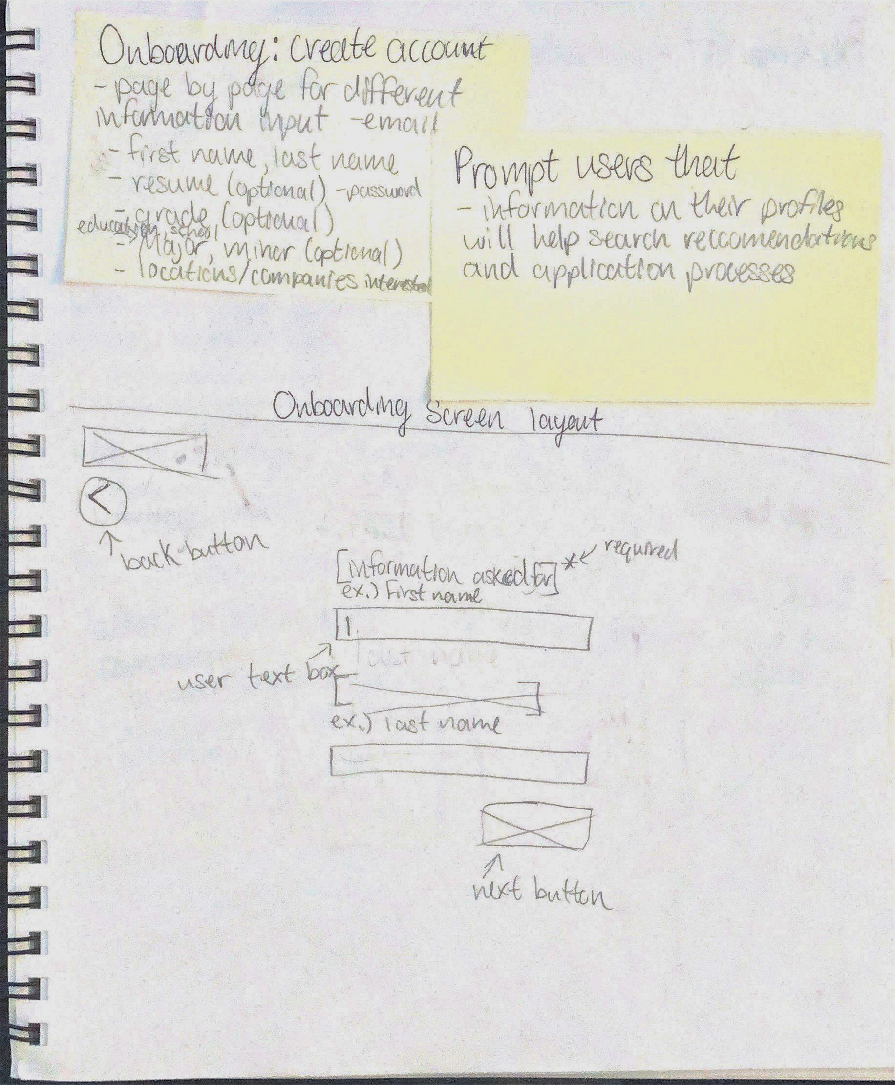
Onboarding Screen Wireframe Sketch

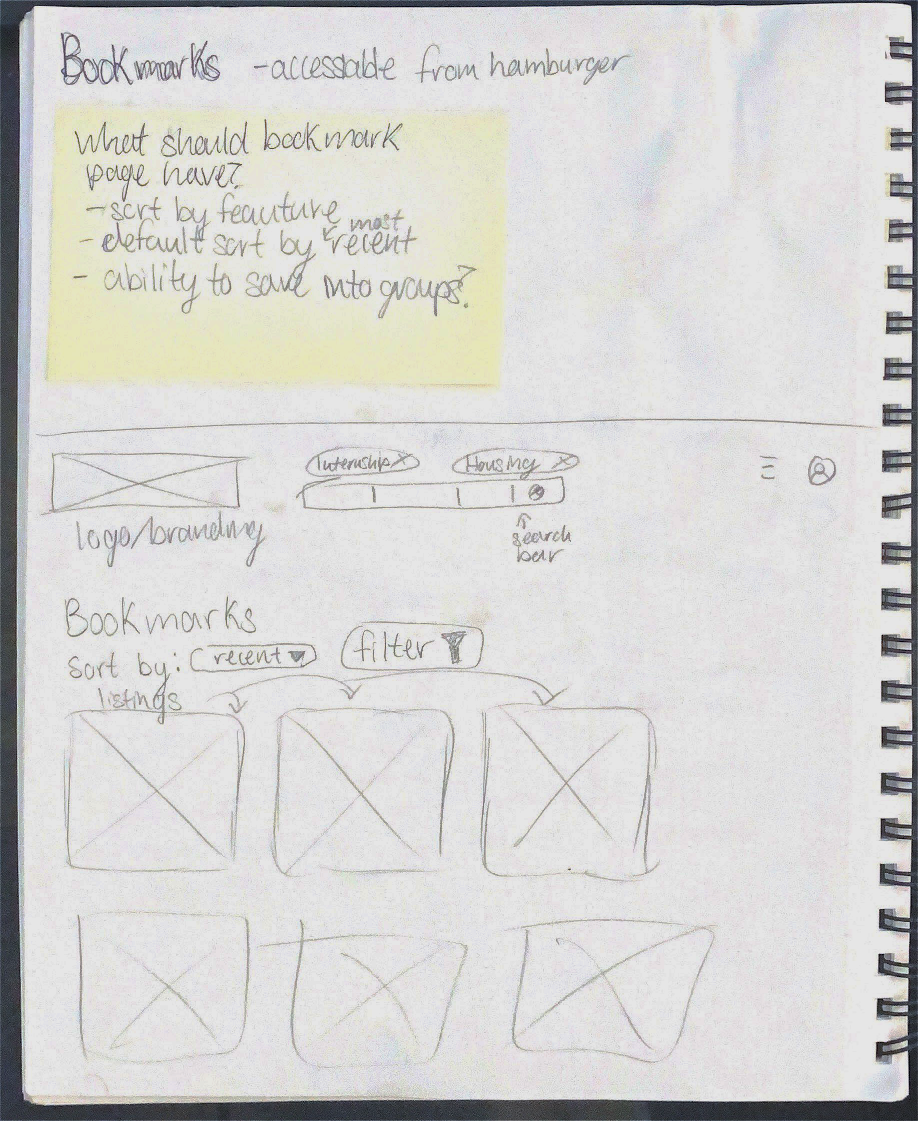
Bookmarks Screen Wireframe Sketch

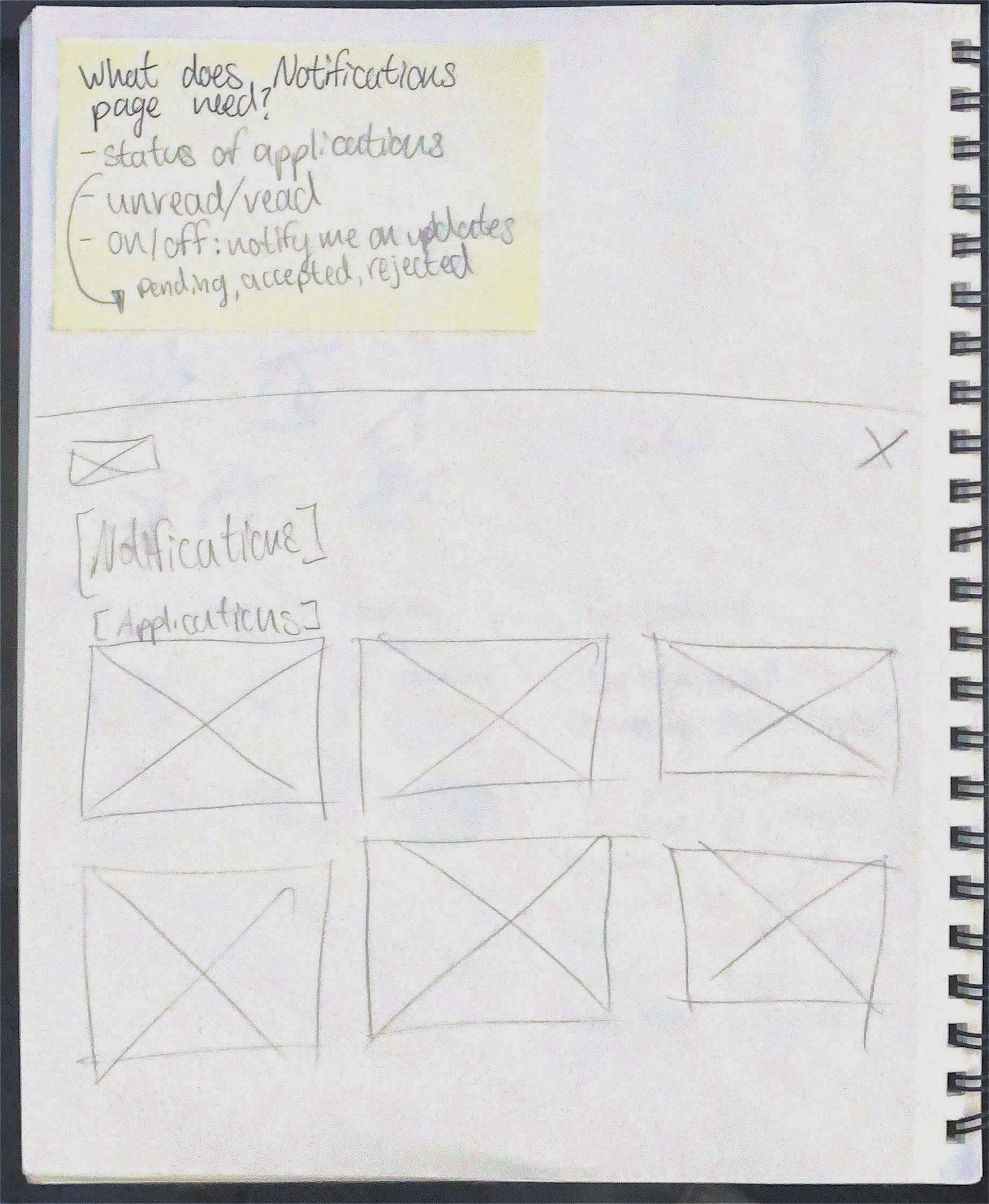
Notifications Screen Wireframe Sketches

Low-Fidelity Wireframes I
Taking the initial paper sketches and recreating them in Figma. This allowed me to have a better understanding of spacing within digital parameters.
Initial Home Screen Digital Wireframe

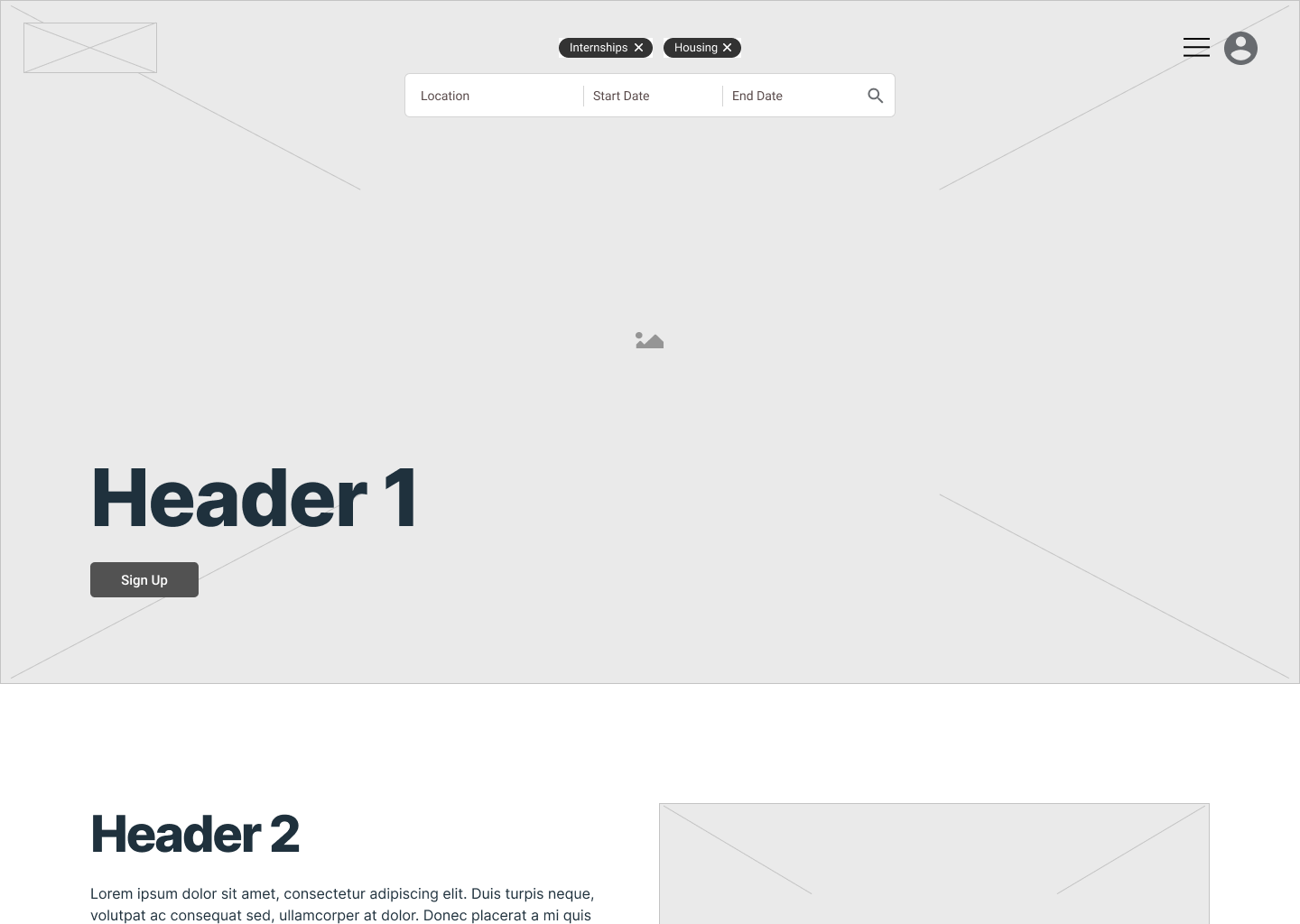
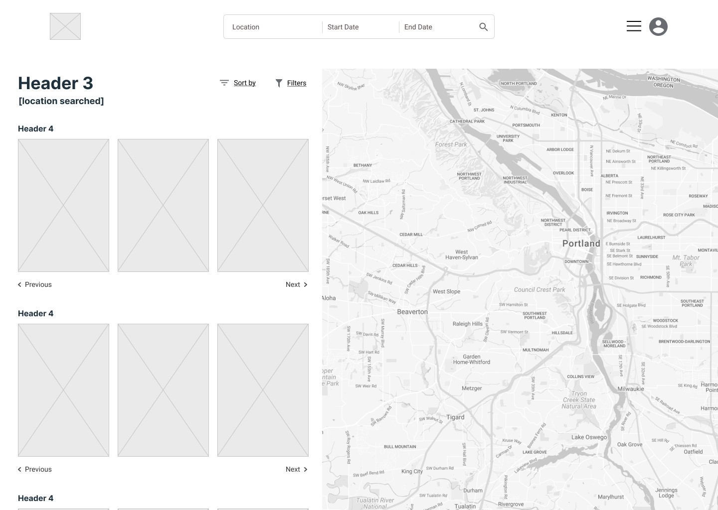
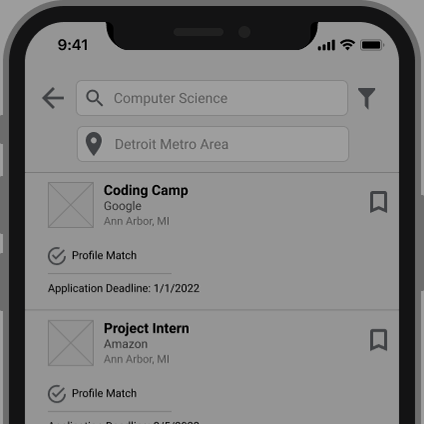
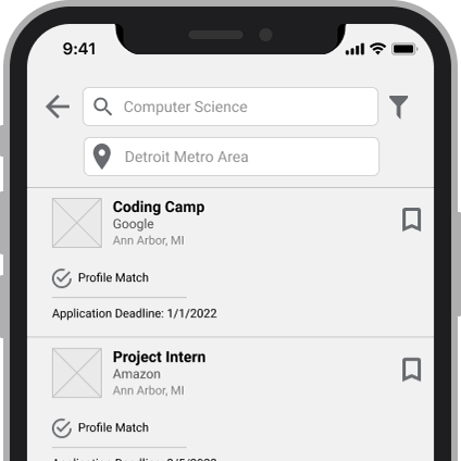
Initial Listings Screen Digital Wireframe

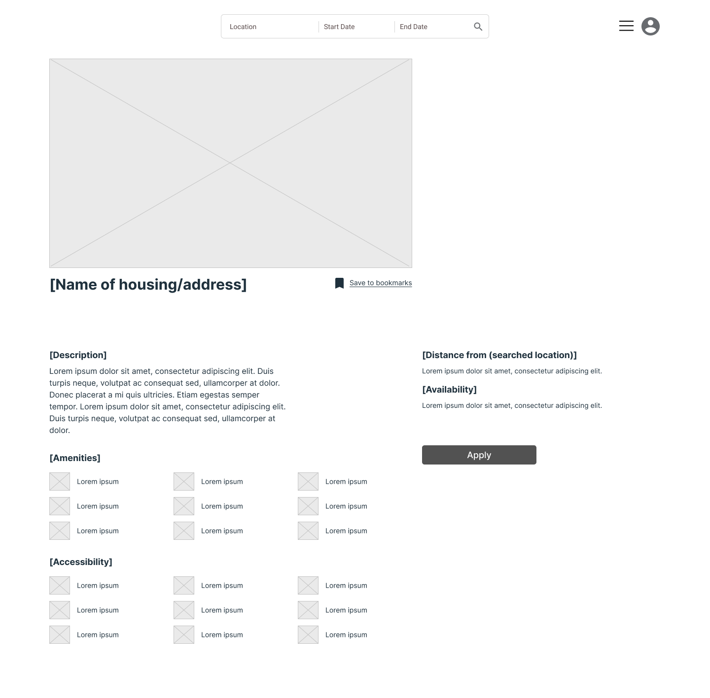
Initial Expanded Listing Screen Digital Wireframe

T a k e a w a y s
The app interactions users expect are important to keep in mind for later implementation.
Visual design
Branding

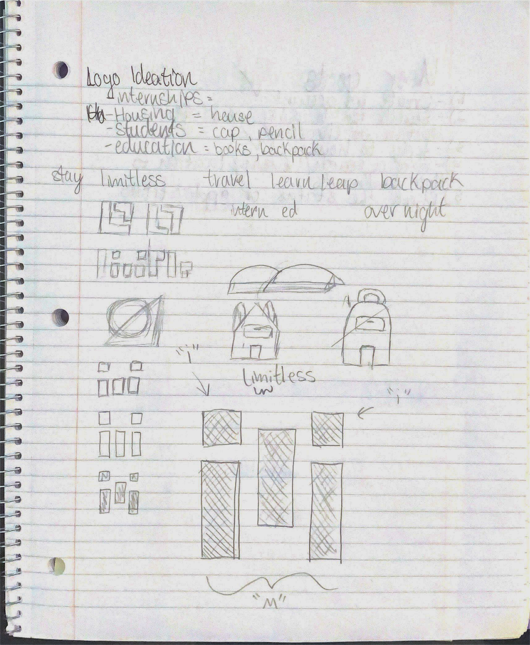
Initial Limitless Logo Sketching

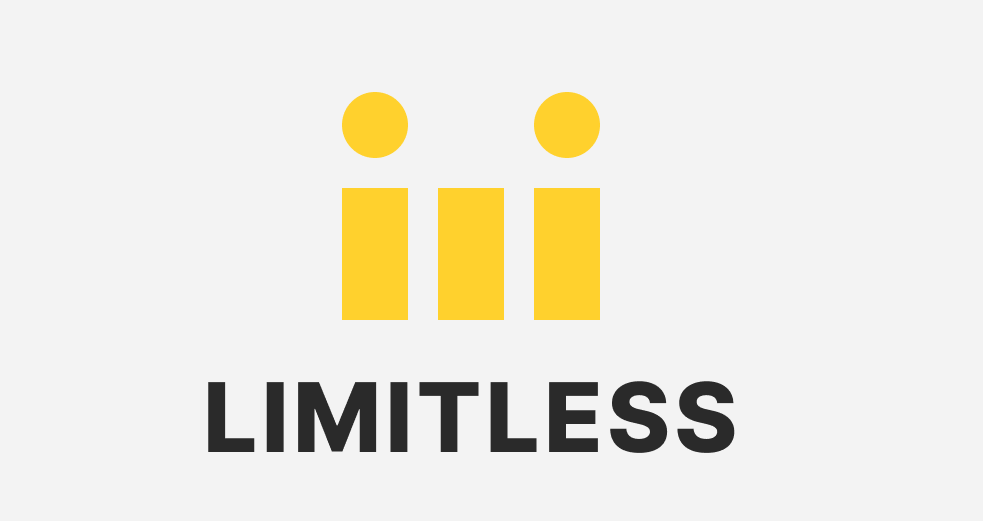
Limitless Digital Logo

The name "Limitless" came to fruition through the thought process and reasoning that the platform's purpose is to help students reach for more opportunities by removing their limitations. 
I chose a shade of black as the primary color and a shade of yellow as the secondary for highlights. The black and yellow combination would suite the professionalism I wanted to express to users and the yellow would help symbolize accomplishments and academics.
The logo came to stand for the "imi" within "Limitless", I wanted to have a logo that was welcoming yet professional. But, there wasn't much other meaning within the actually logo to represent the platforms purpose.
Rebranding
With feedback from target users and other UX Designers I was given enough reason to rebrand the platform due to lack of justified design behind Limitless' logo in accordance to the purpose of the platform. I then brainstormed words related to the platform's purpose. This led me to the final brand name "Capstone".

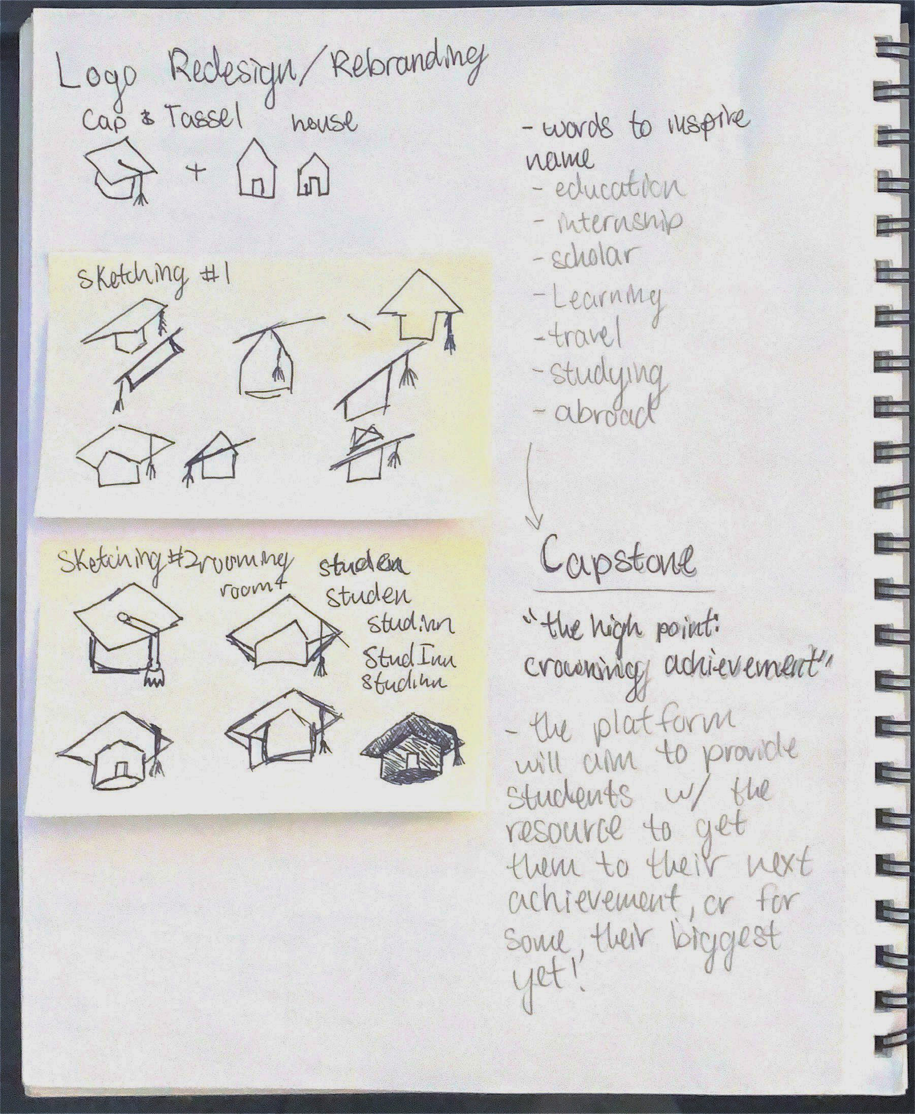
Initial Capstone Logo Sketching

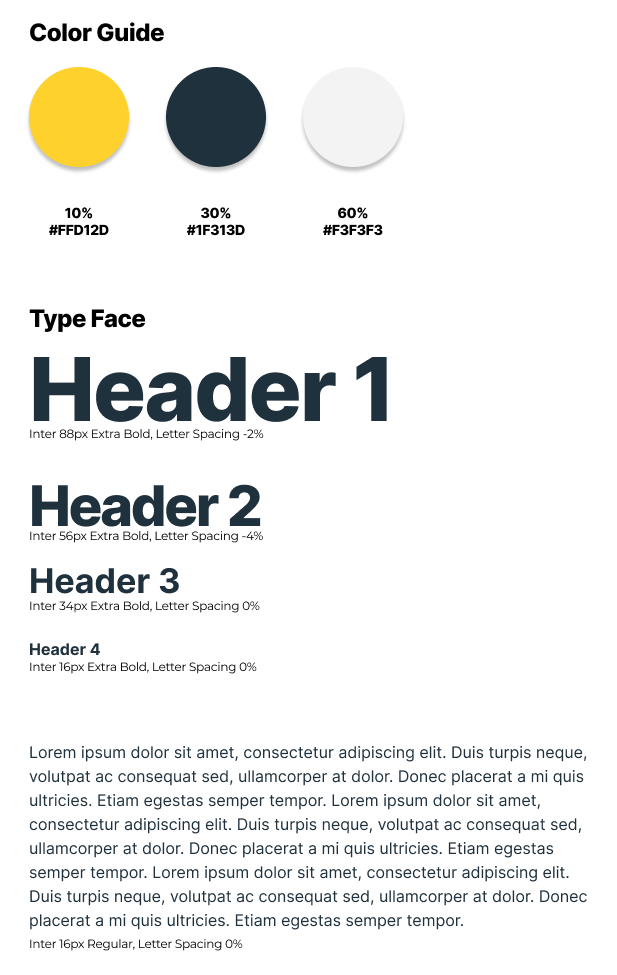
Capstone Digital Logo
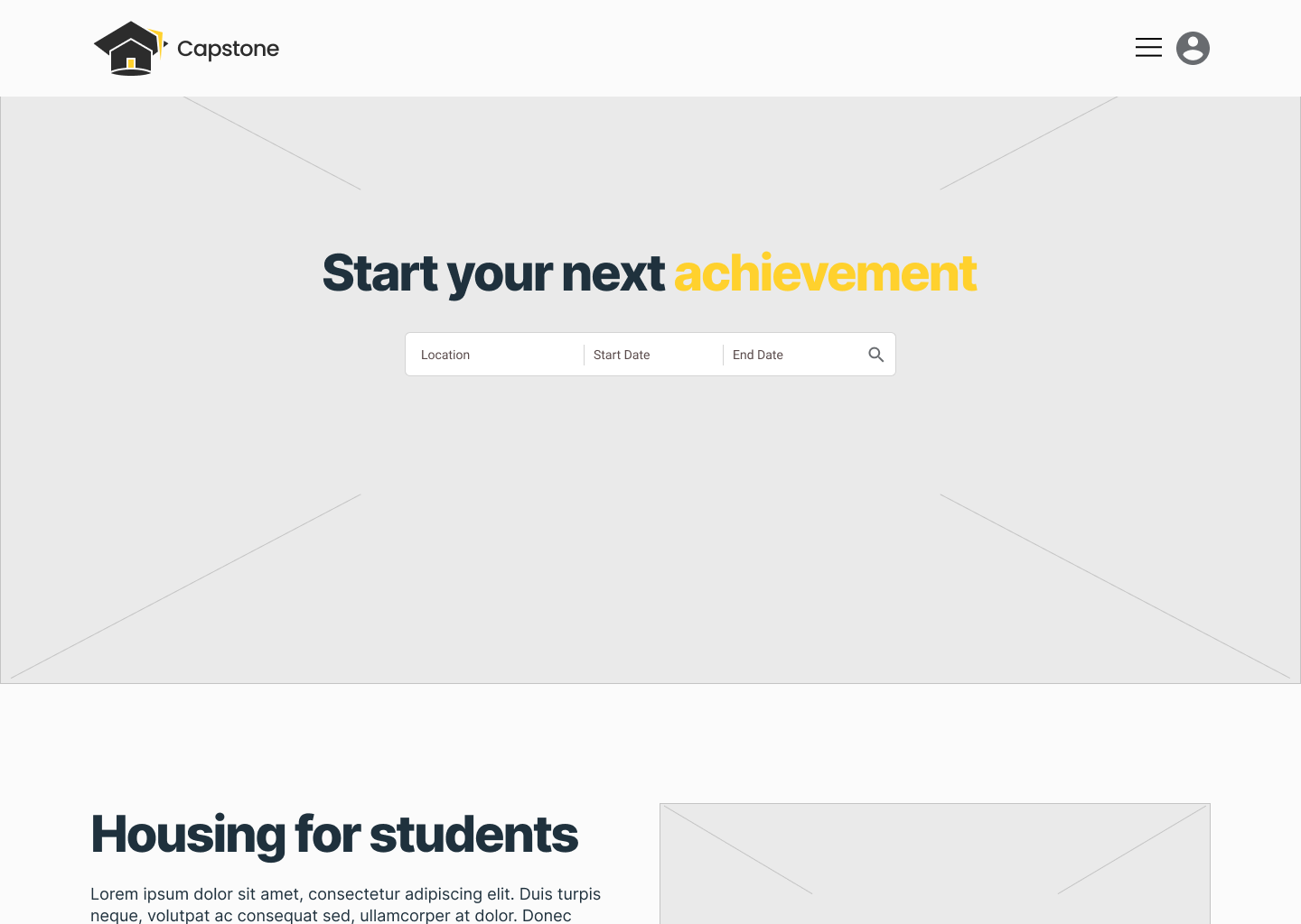
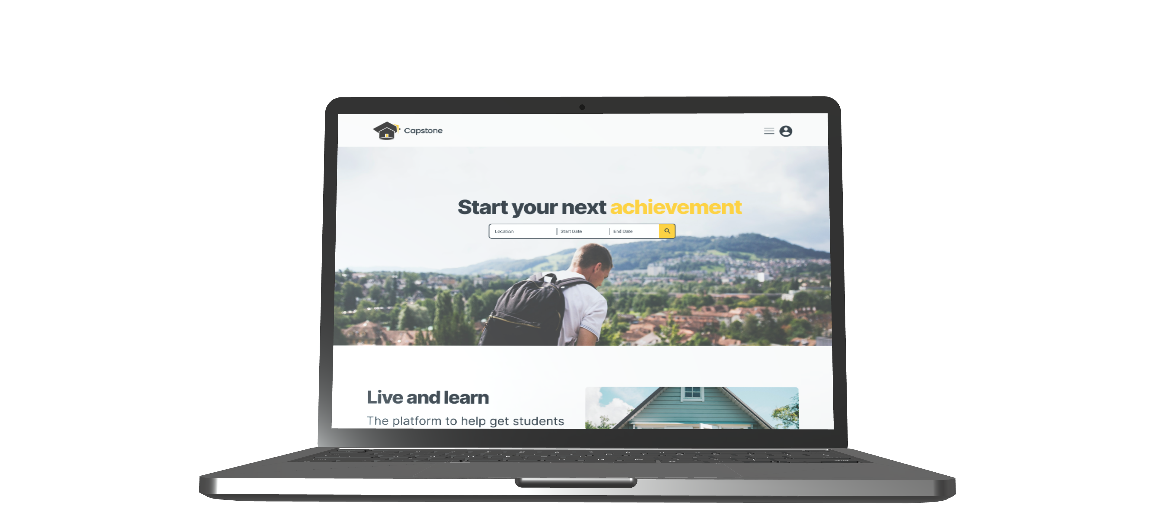
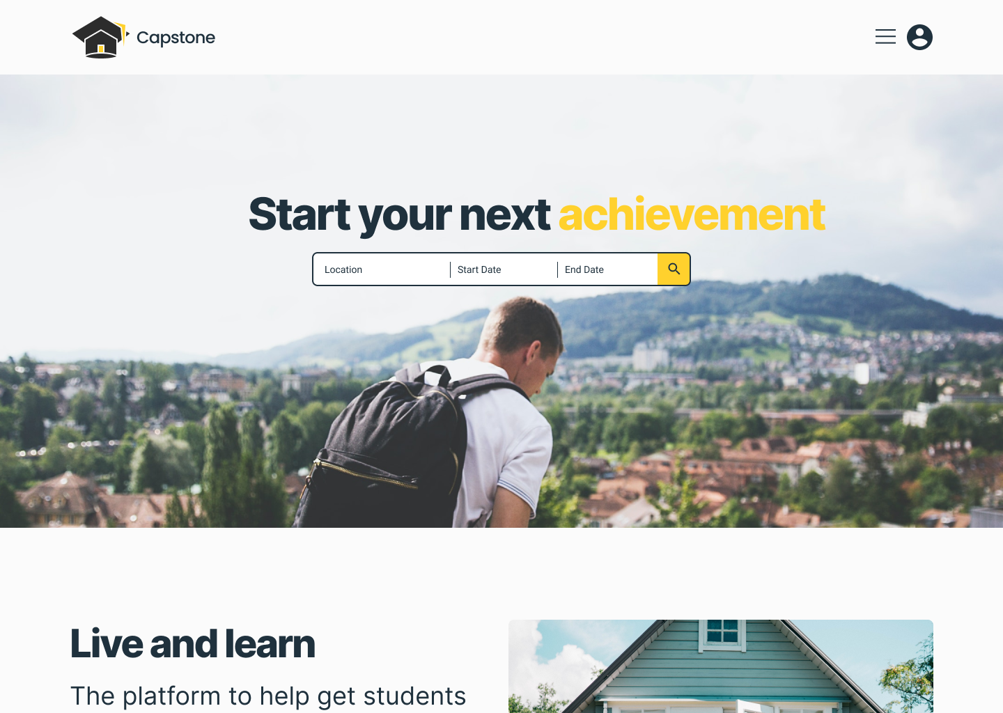
The brand justification this time was the definition of capstone aligned with the platforms goal of being the bridge students would utilize to reach their next achievement. 
The logo then came about of a graduation cap and tassel combined with a house. The graduation cap was inspired by the achievement of a student and the "Cap" within "Capstone". While the house representing the focus on short-term housing for users.
I kept the color palette the same as before because the intentions behind the colors were still prevalent in this branding.
Style Guide
Low-Fidelity Wireframes II

Refined Home Screen

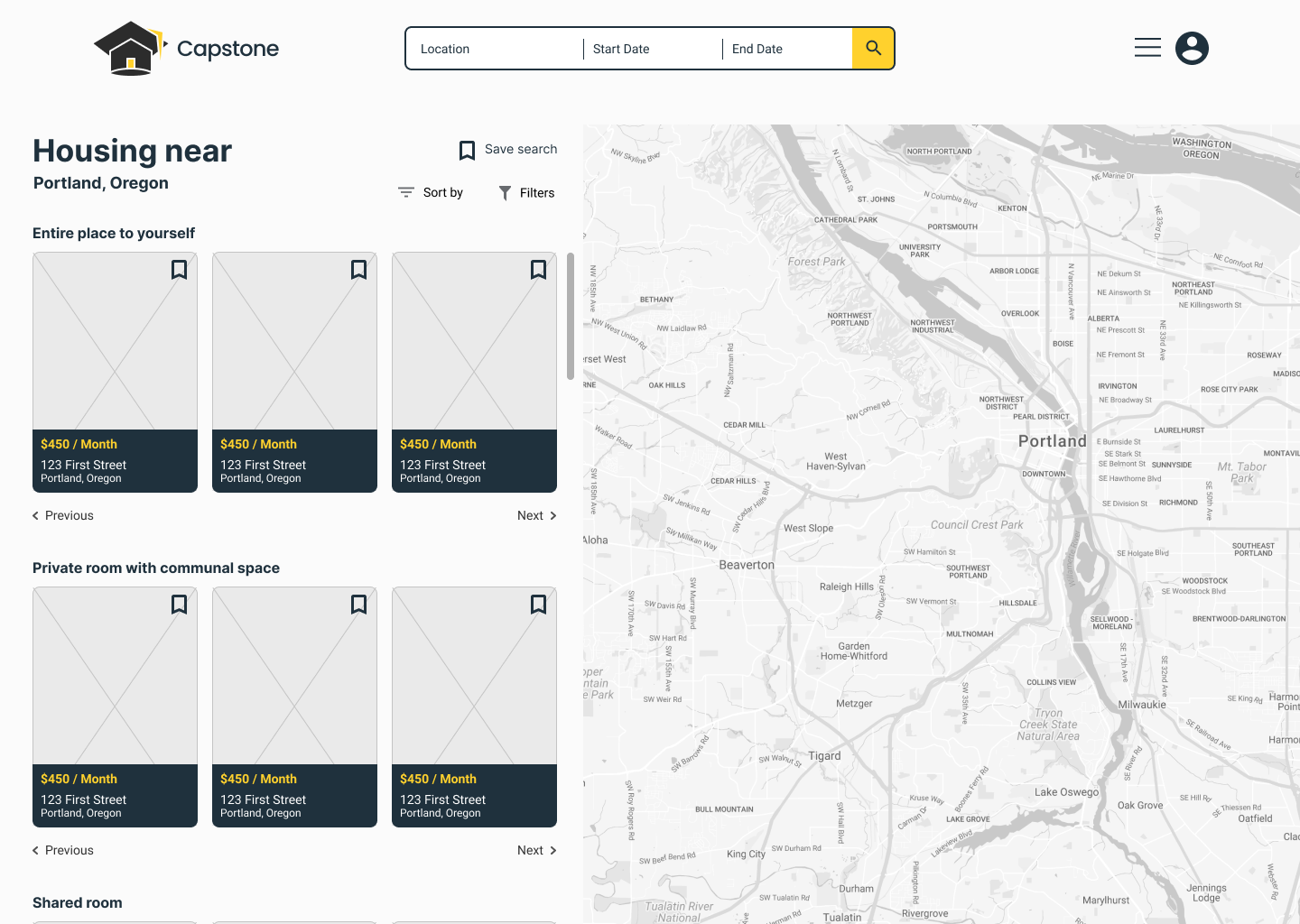
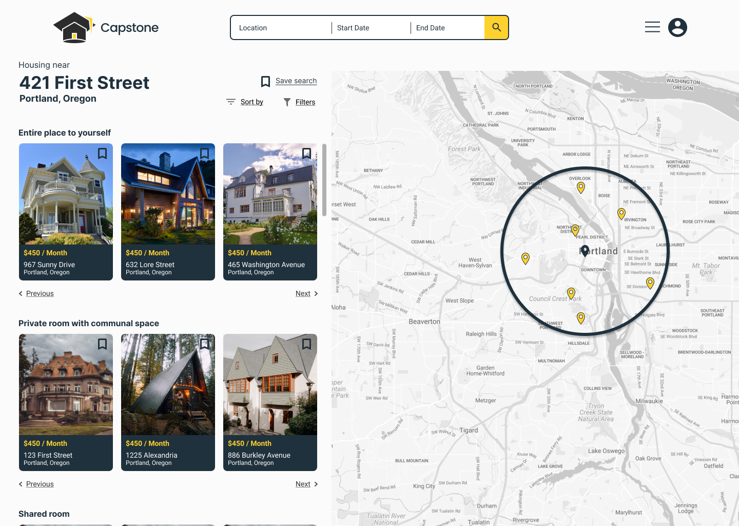
Refined Listings Screen

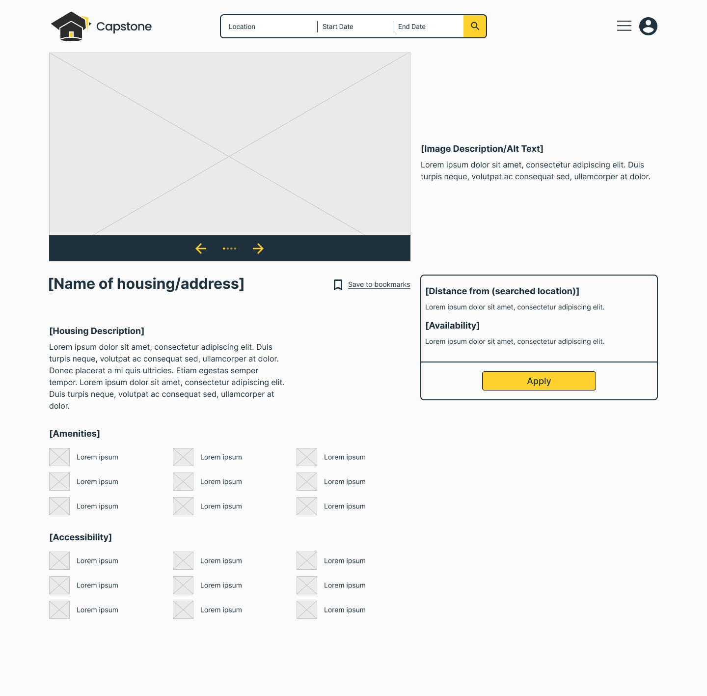
Refined Expanded Listing Screen

High-Fidelity Prototype I
Initial High-Fidelity Home Screen

Initial High-Fidelity Listings Screen

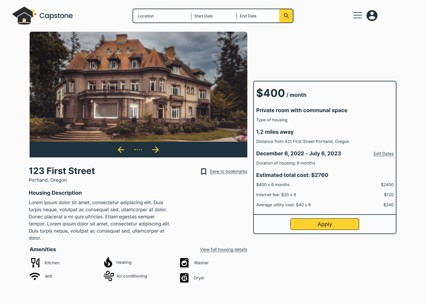
Initial High-Fidelity Expanded Listing Screen

Usability Tests
Screening
• Between 21-23 years old
• Senior in their undergraduate program
• Survey participant open to traveling for an internship
• Survey participant currently searching for internship housing
Scenario
Imagine you currently live in Detroit, Michigan. You have an internship lined up for in downtown Portland, Oregon at the address 421 First Street. Because of the distance you need to relocate for the internship. You want to save money on commuting costs and if possible walk or bike to your internship when possible. Using the application show me how you would find out what the closest housing option is arriving and how you would apply for it.
Task I
Apply for the closest housing option to 421 First Street, Portland with the start and end dates 12/06/2022 - 07/06/2023 respectively.
Scenario Continued
It has been a few days since you applied to a few housing options in Portland. You want to check your applications and see if there have been any updates. You’re using a new device and you have to sign back into your account. Using the application show me how you would sign back into your account and check the status of your applications.
Task II
Navigate to your existing housing applications and check the status of each one.
T a k e a w a y s
Participants reported to not know if their mouse was over a button or if the button wasn’t working
A mistake was allowing participants to apply for the housing task without creating an account
Participants struggled with the onboarding in the beginning screens by trying to use the next button before entering in the information required
Participants were unsure if they finished their tasks properly
Iterations and revisions

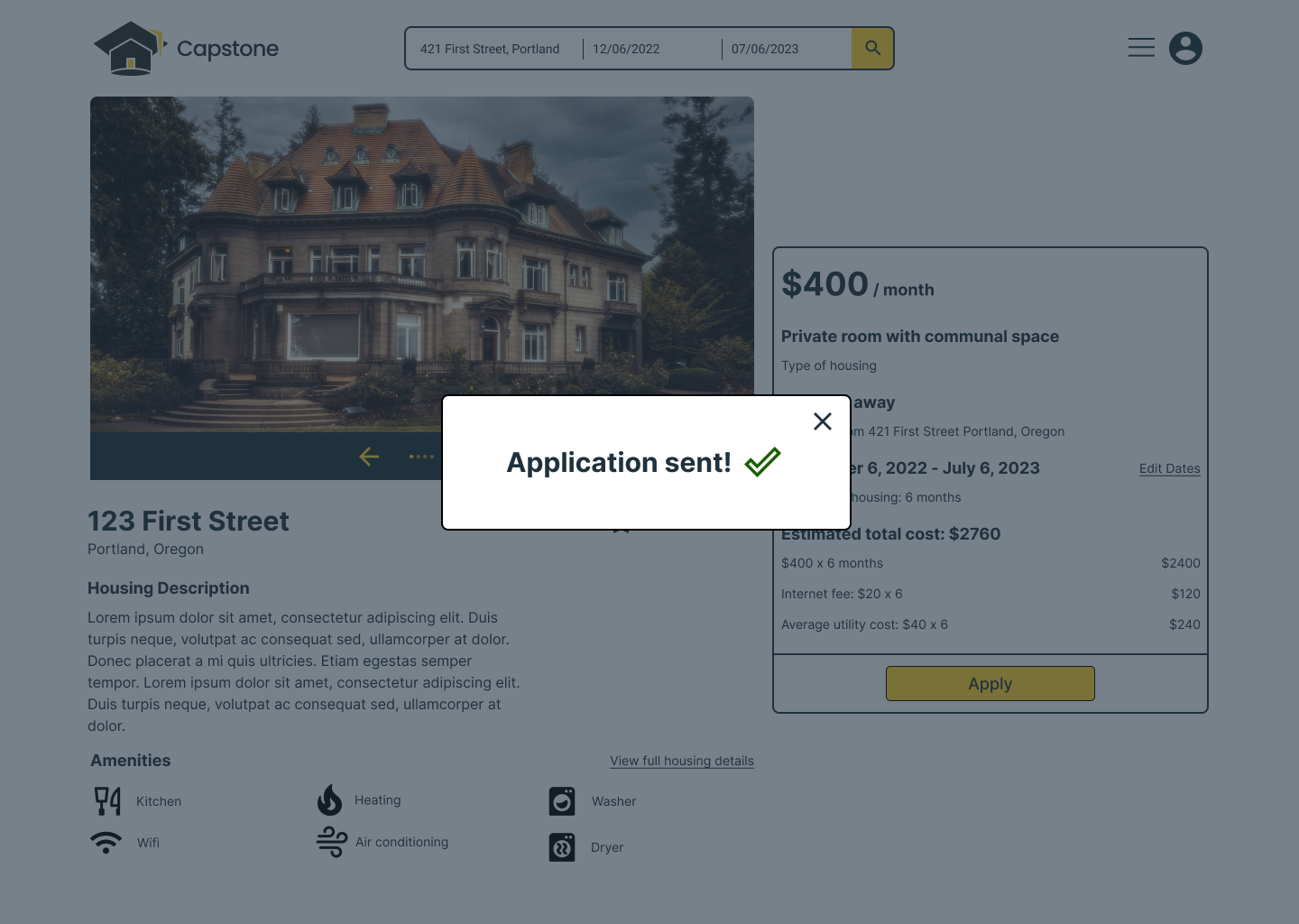
Confirmation prompts for completed actions

Onboarding Screen with inoperable button states

• Hover states added to buttons
Fixed the bug and added improved paths to creating an account before being able to apply for housing
• Creating inoperable button states to indicate to users they can’t utilize it yet/anymore​​​​​​​
• Adding confirmation prompts to finished actions
 High-Fidelity Prototype II
Final thoughts
Successes
• I'm very happy with how the rebranding of the platform name and logo coordinated very well with the goals of the project​​​​​​​

​​​​​​​Keeping a very clean and simple design layout to helped reduce the learning curve of the platform for users
Lessons Learned
​​​​​​​Before handling any of the branding, understand the purpose of the platform and ideate to see where that leads.

​​​​​​​Account for hovering and "when clicking" interactions to indicate usability to users​​​​​​​

​​​​​​​In order to communicate completed actions to users, be sure to give confirmation messages or prompts

You may also like

Back to Top