Roam Case Study \\ 2021
Improving midwest
Public BUS transportation
SUMMARY
Due to recent expansions, numerous bus routes have been recently added to the city’s public transit system, and many of the those routes stop at the same bus stop. Roam is an application created to address these problems through a human centered design.
THE PROBLEM
Users want to know what bus is arriving next and how much time they have
left to get to the bus stop.
left to get to the bus stop.
The bus stop at Washington & State has multiple bus lines running through it making it difficult for users to find their bus.
the scope
Design a high fidelity mobile application that will communicate transit information effectively
MY ROLEs
UX RESEARCHER
• Conduct user surveys with the target audience in order to produce user personas to better understand the user base.
• Manage usability tests, on paper prototypes and low-fidelity prototypes to obtain user feedback.
• Manage usability tests, on paper prototypes and low-fidelity prototypes to obtain user feedback.
UX DESIGNER
• Translate data from user research to develop empathy maps, journey maps, storyboards, and flowcharts to understand the user processes from start to finish within the application.
UI DESIGNER
• Produce sketched wireframes, digital wireframes, low fidelity application screens and iterate them based upon user feedback to create a high fidelity application.
• Produce sketched wireframes, digital wireframes, low fidelity application screens and iterate them based upon user feedback to create a high fidelity application.
solution
Design a transit app that will help users navigate the local bus system
Effectively communicate which bus is arriving and how much time users have
to get the bus stop
to get the bus stop
Discovery and Research
This is the where I began the initial brainstorming for the application. This phase focused on gaining information on the target users and understanding them on deeper levels. Taking the pain points of users and creating opportunities to explore within the application.
Designing the app
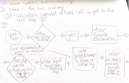
User Flows Sketches
Developing initial idea of how user will navigate through the application
User Flows Refined
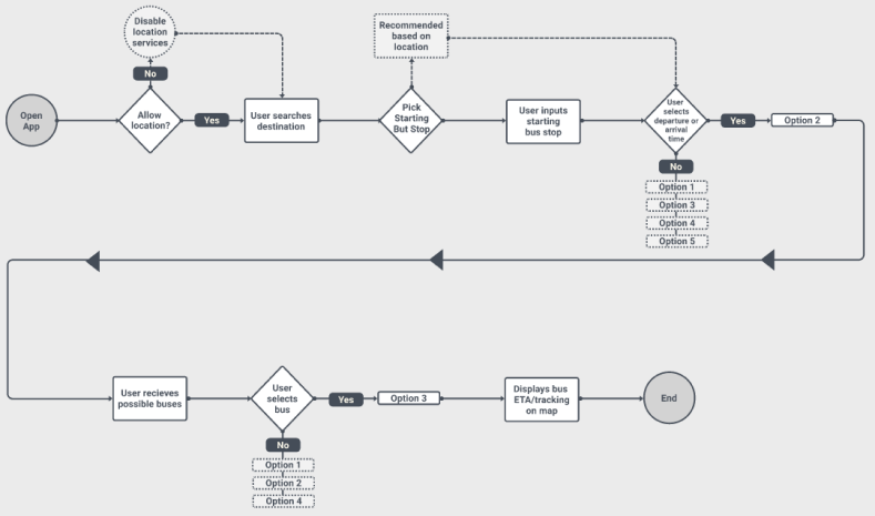
Finalizing the user flow. Focusing on the user goal of traveling between bus stops and tracking the arrival ETA of their bus.
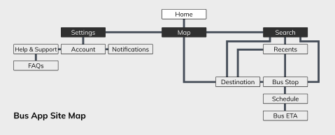
Site Map Sketches
Rough ideation of navigation through the application
T a k e a w a y s
• Set the foundation for what the application components could look like and ideas to possibly implicate
User Research
Tools Used
Google Surveys
Notion
Figma
Zoom
Slack
Notion
Figma
Zoom
Slack
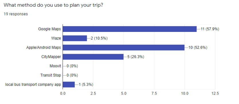
User Surveys
Sample size: 25 total survey responses
Summary of results
• 94.4% of users miss their bus due to it not arriving according to schedule
• 50% of users wait on the wrong side of the street for their bus
• 55.6% of users take the same route most of the time
• 50% of users worry about missing their bus
• 94.4% of users miss their bus due to it not arriving according to schedule
• 50% of users wait on the wrong side of the street for their bus
• 55.6% of users take the same route most of the time
• 50% of users worry about missing their bus
T a k e a w a y s
• Users rely mostly on Google Maps and their native navigation app currently to plan their bus transit
• The most common reason for users missing their bus is due to it not arriving according to schedule
• Users commonly stress about missing the bus
• Users typically take the same route
• The most common reason for users missing their bus is due to it not arriving according to schedule
• Users commonly stress about missing the bus
• Users typically take the same route
User Persona 1:
Katie
Katie
Demographics:
Katie is a 22 year-old senior at her university in downtown Chicago. She's preparing for nursing school and works full-time without many breaks throughout the day. She depends on the local bus transit to get around Chicago but is consistently stressed out from the lack or reliability in the bus schedule.
Behaviors:
• Rides local bus system to get around in the city/get to work
• Arrives at her stop up to 30 minutes before bus arrives
• Plans the same commute in advance
• Takes the bus 2-4 days
• Rides local bus system to get around in the city/get to work
• Arrives at her stop up to 30 minutes before bus arrives
• Plans the same commute in advance
• Takes the bus 2-4 days
Goals & Needs:
• Needs to use local transportation
• Find a better way to plan commutes
Frustrations:
• Unable to get food after work due to inconsistent bus schedule
• Worries about missing the bus
• Can not afford to buy her own car
• Needs to use local transportation
• Find a better way to plan commutes
Frustrations:
• Unable to get food after work due to inconsistent bus schedule
• Worries about missing the bus
• Can not afford to buy her own car

Empathy Map & Journey Map
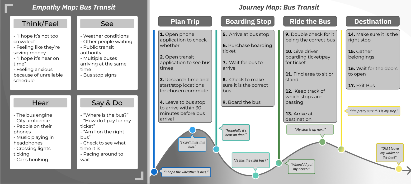
T a k e a w a y s
• Presented key pain points that our users commonly feel to keep in mind for the MVP
• Presented opportunities for the design and features of the application to implement for the MVP or in the future
• Presented opportunities for the design and features of the application to implement for the MVP or in the future
Information Architecture
After developing a deeper understanding of the target users, I moved into developing the ways the user will interact with the application. Understanding the goals of the users and applying that into the structure of the application. Then finally developing an initial prototype.
Site Map Refined
Finalizing the user flow. Focusing on the user goal of traveling between bus stops and tracking the arrival ETA of their bus.
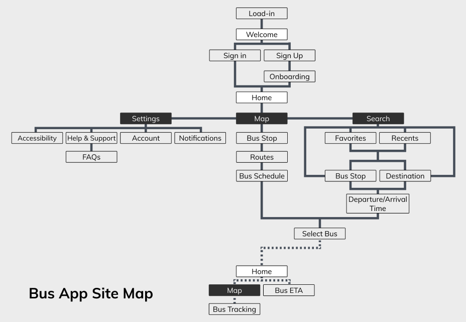
T a k e a w a y s
• Helped confine the scope of the application to better focus on the MVP while also giving direction to how the application screens/features are expected to function.
Wireframes sketches
Initial brainstorming of application screens on paper. This enabled a quick rudimentary idea to form for the navigation and relationship between screens.
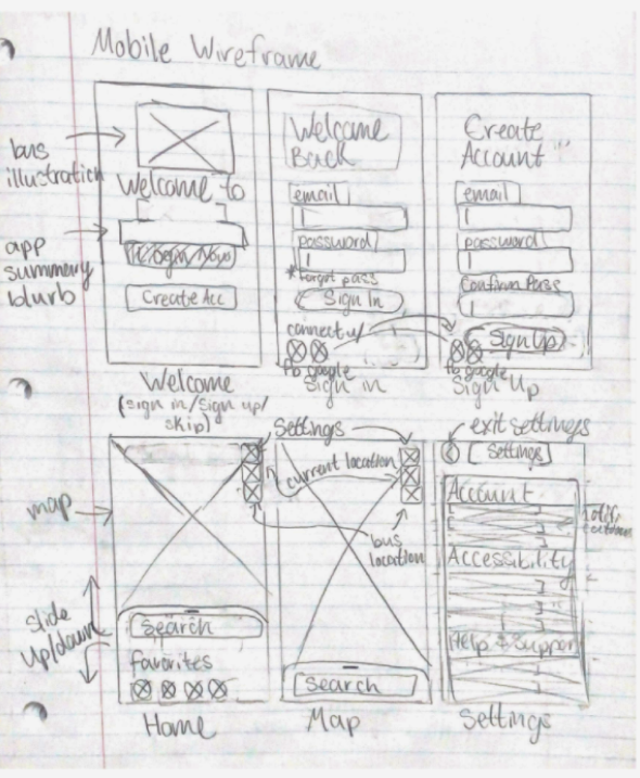
Onboarding Wireframe Sketches
Home Screen Wireframe Sketches
Low-Fidelity Wireframes I
Taking the initial paper sketches and recreating them in Figma. This allowed me to have a better understanding of spacing within digital parameters.
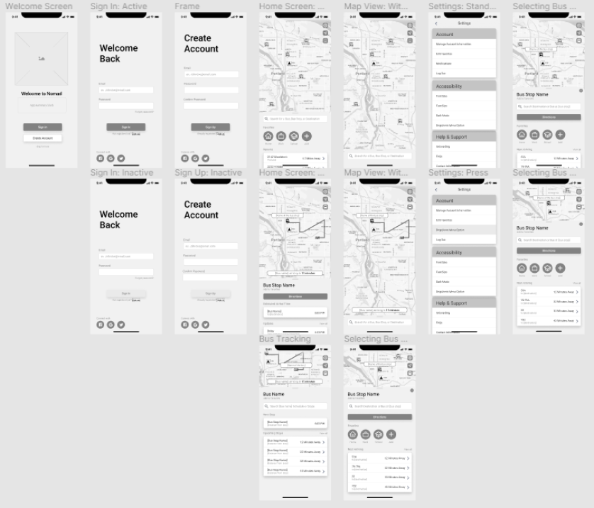
Initial Digital Wireframe
T a k e a w a y s
• The app interactions users expect are important to keep in mind for later implementation.
Visual design
Branding
After brainstorming application names I ended between Nomad and roam. I ended up deciding to go with roam because of the simplicity of the name and a logo concept I had thought of that could well define the application. Making a bus out of the word "roam".
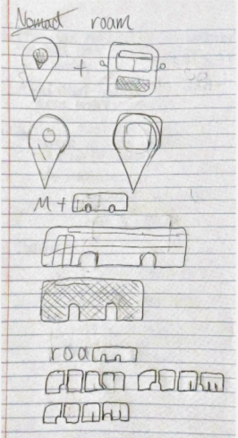
roam Logo Sketching
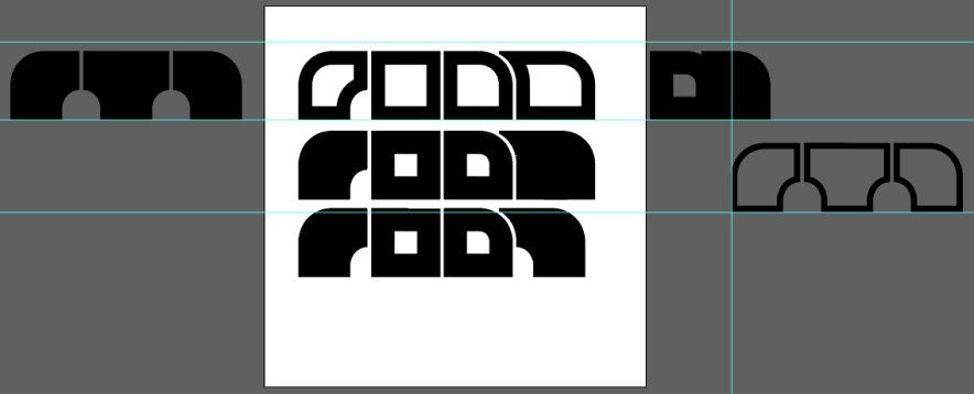
roam Digital Logo Ideating

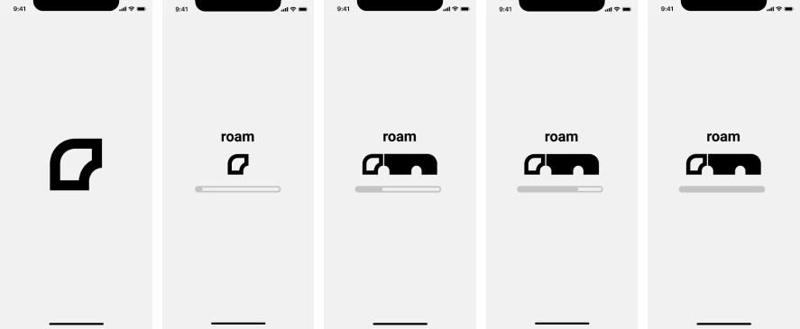
roam Finalized Logo
I decided to go with a bit of a more abstract logo for roam. A lower case "r" making up the front of the bus that is just more mirrored letter r's. Really happy with the way it turned out. You can visualize the "r" very easily and the bus as well almost immediately. I tested the logo on a few of my roommates without any context and they were able to understand the "r" and the bus within it.
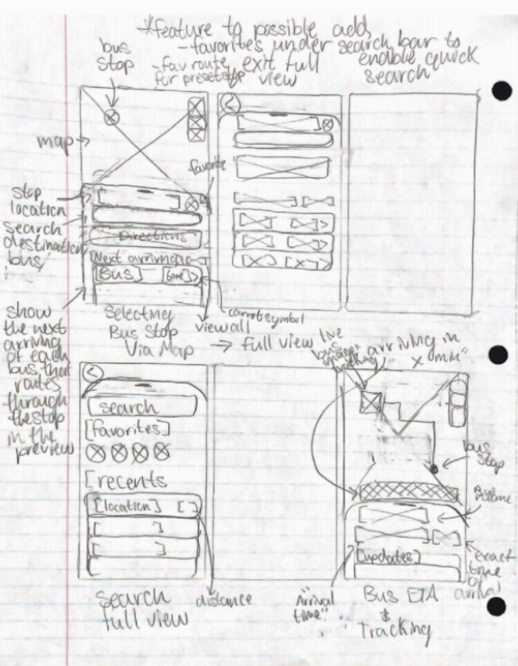
Low-Fidelity Wireframes II
Refined Wireframe
Style Guide I
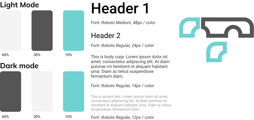
I choose the grey and light blue to act as calming neutral colors for users to interact with to help start reducing stress from public transit.
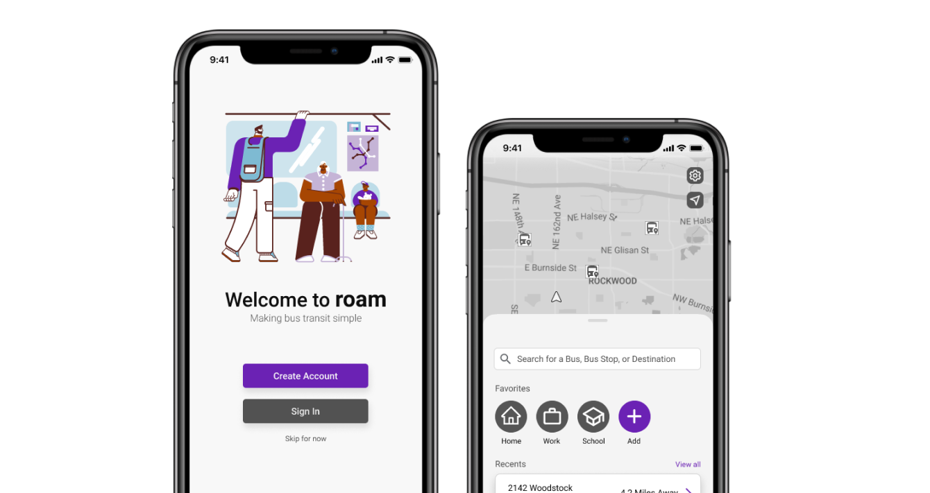
High-Fidelity Prototype I
High-Fidelity Prototype I
Style Guide II
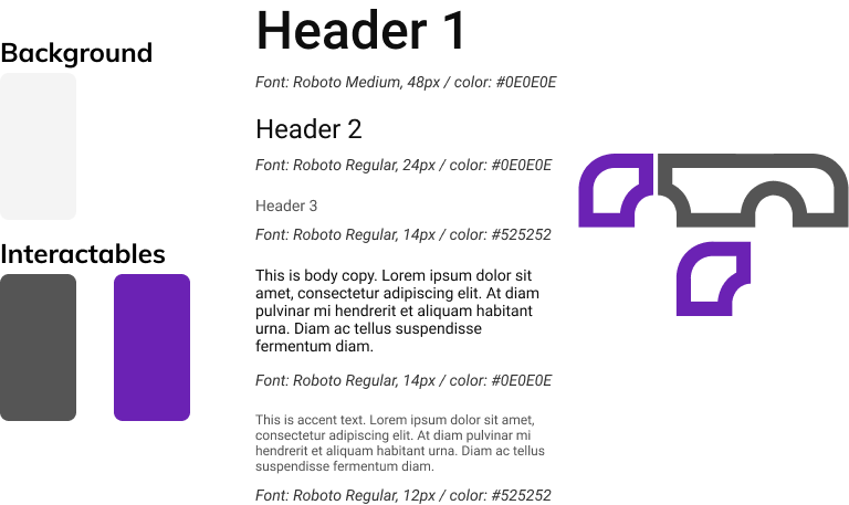
I had to take a second look at the color palette I had chosen due to it not passing the WCAG AAA Color Contrast Checker. I had to chose colors that better contrasted the grey background throughout the application. I still wanted to try and utilize a calming color palette so I decided to work with a dark purple as my main complementary color to the rest of the application in order to stay away from anything else too aggressive on the eyes.
T a k e a w a y s
• Always check to make sure the color palette you plan to utilize passes the WCAG AAA Color Contrast Checker before applying it.
High-Fidelity Wireframes II
High-Fidelity Prototype II
Usability Tests
Screening
• Currently or previously used public transit
• Age: 18-24 years old
• Age: 18-24 years old
Scenario
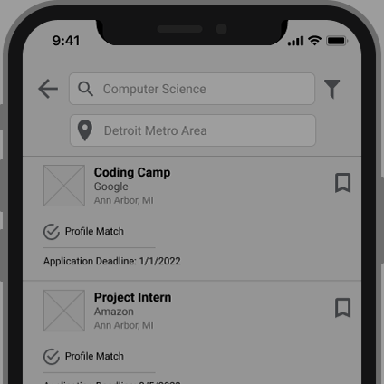
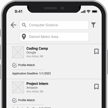
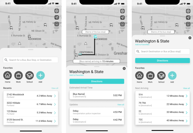
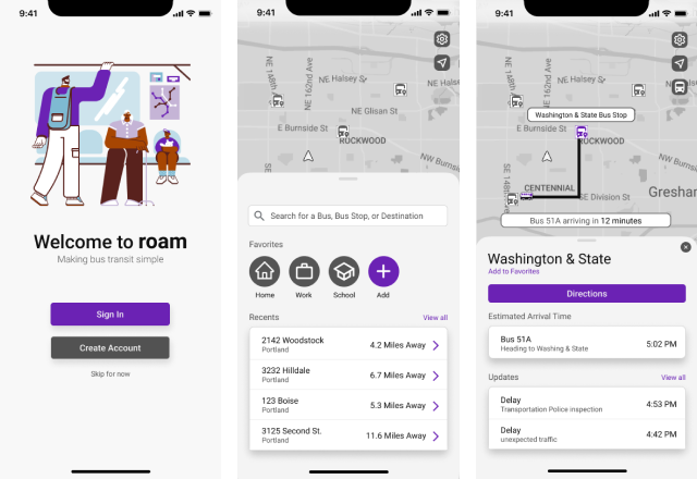
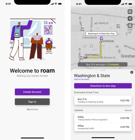
Imagine you’re trying to meet with a friend to grab a coffee in the city. You’re planning to meet with them at a local bus stop, Washington & State, and head there together. You know the bus you’re taking is bus 51A but you don’t know when it will be arriving. Using the application show me how you would find out when bus 51A is arriving and how much time you have left to get to the bus stop.
Tasks
1. Find out when bus 51A is arriving at the Washington & State bus stop.
2. How much time is left to get to the Washington & State bus stop.
2. How much time is left to get to the Washington & State bus stop.
T a k e a w a y s
• Users couldn’t tell which direction the bus was heading
• Users were confused if the “directions” button was intended to route to the bus stop or the current location of the bus
• Users stated they had a hard time differentiating the bus route on the map from the map itself
• Users were confused if the “directions” button was intended to route to the bus stop or the current location of the bus
• Users stated they had a hard time differentiating the bus route on the map from the map itself
Iterations and revisions
Style Guide III
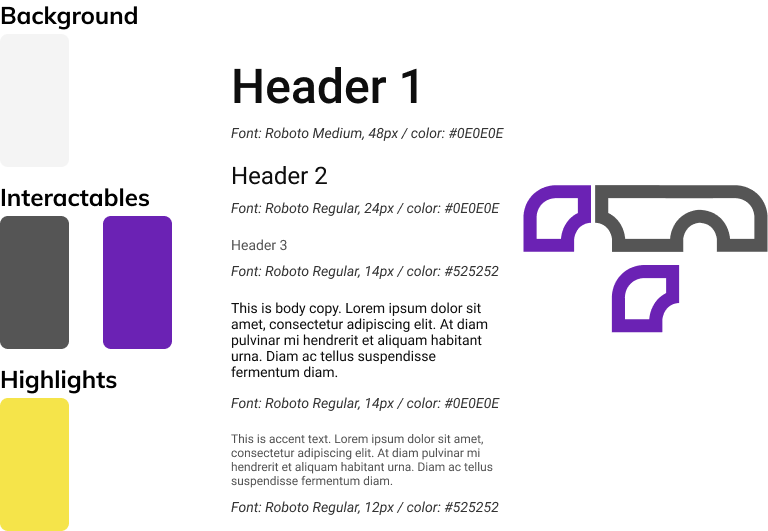
In order to help differentiate the bus route from the map I decided to add in the addition of a highlight color, yellow, to depict important information for the user to distinguish against the rest of the application.
I also changed the highlighted bus route to end with an arrow head to better inform users to know which direction the bus is heading toward.
High-Fidelity Prototype III
Final thoughts
Successes
• Iterating based upon feedback each time to better accessibility and usability
• Staying true to a calm color palette and ease of use application to help reduce stress of users
• Staying true to a calm color palette and ease of use application to help reduce stress of users
Lessons Learned
• Iterations will always happen there's always somewhere for improvement or optimization.
• Plan ahead of time, check to make sure you meet accessibility requirements before moving too far into a project.
• Plan ahead of time, check to make sure you meet accessibility requirements before moving too far into a project.